What factors go into an Artisan-style label?
Here are the key factors that define a truly artisan-style product label:
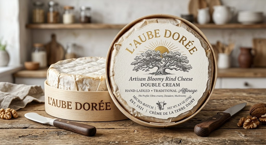
1. Tactile Material & Texture Artisan products are meant to be handled. The “feel” of the label is often just as important as the look. Uncoated Paper: Using matte, “toothy,” or wine paper stocks instead of high-gloss plastic. Embossing: Raising certain elements (like a logo) to create physical depth. Kraft: Using brown kraft paper suggests eco-friendliness and “straight-from-the-farm” origins.
2. Custom Die-Cuts Standard rectangles look like commodities. Artisan labels use custom shapes to stand out: Organic Edges: Arched tops, scalloped borders, or shapes that follow the contours of an illustration. The “No-Label” Look: Using clear, pressure-sensitive labels with minimalist printing so the product inside (the honey, the sauce, the oil) is the star.
3. “Human” Typography: Avoid generic, overused corporate fonts. Artisan labels often mix styles to create a “curated” look: Hand-Lettering: Custom scripts or “imperfect” brushstrokes that imply the maker signed off on it. Vintage Serif Fonts: Typefaces that feel like they came from an old-world printing press. Hierarchy: Key information (the batch number and the flavor) often looks as if it were stamped or handwritten later.
4. Limited Color Palettes. While mass-market brands use bright, neon “buy me” colors, artisan brands tend to be more restrained:
Earthy Tones: Sage Greens, Terracotta, Deep Navy, or Charcoal. Metallic Accents: Using Gold or Copper foil sparingly to suggest “premium” without being gaudy. Monochrome: A simple black-and-white design can often look more expensive and sophisticated than a full-color one.
5. Transparency & Storytelling The label is the bridge between the maker and the consumer. Batch & Bottle Numbers: Space for “Batch No. ____” or “Bottled on ____” (even if printed) adds a sense of scarcity. The Origin Story: A brief, 2-3 sentence blurb about the process or the source of the ingredients.Signature of the Maker: A printed signature or “Family Owned” seal builds immediate trust.